Boho Curtains: Pattern, Texture and Room Pairings
Boho works best with one strong idea: a pattern, a texture, a knotted heading or an open layer. Build the palette from the room and try three combinations that keep privacy where needed.
By DecoraMintPublished 4-minute readMore in Blinds & Shades
In this guide
A boho window can be dressed in three layers: a long, loose weave that lets the afternoon through like warm dust, a knotted or tasseled panel with its own small drama along the heading, and behind them a plain lined curtain doing the practical work. That is boho at its best, and none of it depends on piling on fringe. Boho is a styling mood that covers many fibers, constructions and privacy levels, so the useful move is to translate it into things you can see and handle: texture, pattern, a heading, a layer.
Start with texture
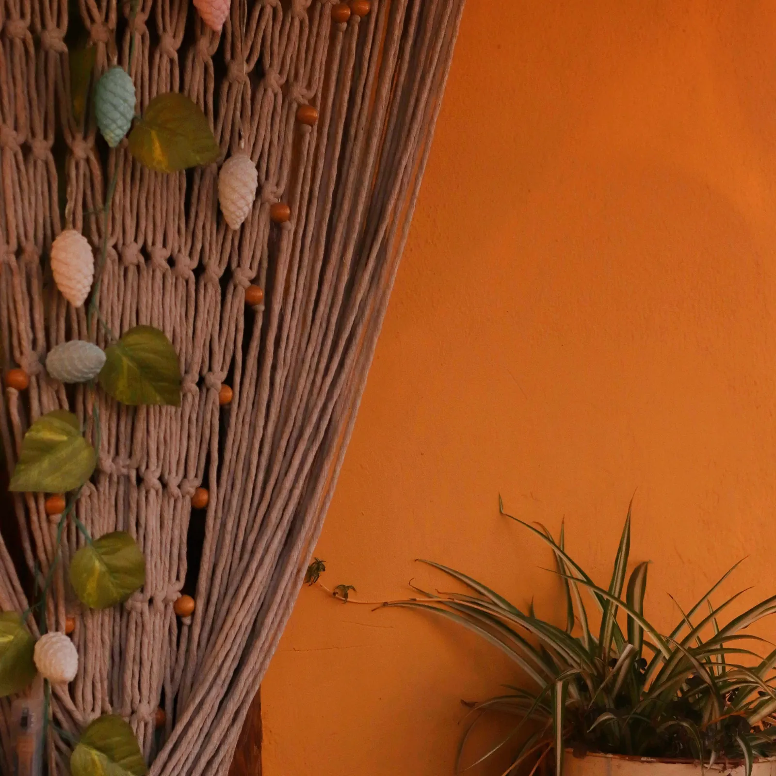
The most reliable boho windows are built from touch. Gauze that crinkles, slubby cotton, open-weave linen looks, crochet and macrame all give a flat wall a handmade feel without needing a single printed motif. Because texture is quiet, it combines easily with a patterned rug, painted furniture or a gallery wall, and it lets the room’s colorful objects stand out.
Two examples from Urban Outfitters show how different the same style search can get. The Knotted Window Curtain is a plain semi-sheer panel with four knotted loops at the top, listed as a single 100% cotton panel; all of the character sits at the heading, and the body of the fabric stays calm. The Chloe Patchwork Gauze Curtain Panel is also a single cotton, semi-sheer panel, but it spreads its interest across a patchwork surface with a tab-top heading. These are listing details we read, not tested recommendations, and the listings may change. The point is the contrast: one puts the detail at the rod, the other across the whole drop.
Pattern that survives the folds
A print photographed flat will not look the same once the panel gathers. Large motifs fall between folds, while small repeats turn into texture from across the room. Open panels concentrate the pattern at the sides, and closed panels turn the whole window wall into one big printed surface, which can be more than you expected. Look for a hanging photograph or a sizable sample, and if you are buying a pair, find out whether the maker promises pattern matching between panels. Two panels sharing a product name will not necessarily line up, which matters most for patchwork and big geometric repeats.
Color from something you already own
Choose one thing in the room as the starting point: a rug, a painted cabinet, a cushion, a piece of art. Hold curtain samples against it in daylight and under the lamps you use at night, and look for a relationship instead of an exact match. A warm, muted panel can repeat a small color from the rug. A curtain clearly lighter or darker than the wall gives stronger contrast, as long as its pattern stays simple. On a wallpapered wall, a textured solid is usually an easier partner than another detailed print.
It helps to hold to one main curtain color, one supporting color somewhere else in the room and one calm neutral. Revise after you see the fabric hanging.
Layers, and who does the work
Open knotwork or a semi-sheer panel softens daylight and leaves plenty of sightlines. Once the room is lit at night, it shows silhouettes freely. Decide which layer does which job: a decorative front layer can sit with a lined curtain or a separately operated privacy shade behind it, provided the hardware and wall space accommodate both. Open and close each layer in the planned arrangement, and see that trim and cords do not snag the moving parts.
For a bedroom, settle light and privacy first, then add texture on top. Judge light blocking by the maker’s stated construction and by how the finished treatment closes.
Some room combinations to try:
- A neutral living room with a patterned rug: a plain curtain that repeats one quiet rug color, with weave or heading doing the decorating, on a simple rod.
- A colorful room with plain furniture: a patterned panel as the main textile, one of its colors echoed in a small object, and plenty of plain surface around it.
- A bedroom that needs a quieter window: the privacy layer first, then a small knotted or tied detail over bedding that already has embroidery.
Fringe, heat and cords
Loose ends and fringe snag on hardware and drag through a radiator or heater area, so keep them well clear of any heat source and follow the appliance’s stated clearances. Decorative loops vary in size, so match the heading to your rod’s diameter by measuring, and include lining and trim in the load the rod has to carry.
Where young children or pets are around, assess accessible cords, loops and loose decorative parts. The CPSC says children have strangled on the cords of window coverings, sometimes in moments, and calls cordless the safest option when young children are present (CPSC). A decorative treatment lacks the safeguards of a purpose-designed child-safe covering.
Reading the label
A rough weave can be linen, cotton or a blend. The FTC’s textile-label guidance explains fiber-content information for covered textiles, so read the actual composition and treat words like boho, natural-look and gauze as marketing. Care applies to the complete panel too. Knots, beads and mixed trims can need gentler handling than plain cotton, so look at the label before buying if you plan to wash often.
Beige is optional; color, pattern or texture can lead. Macrame leaves visible gaps, so give it a lined or shaded layer if the window needs screening. And a quiet textured panel is often the best neighbor for a lively room.