Neutral Rugs: Beige, Brown and Black-and-White Choices
Beige, cream, gray-brown and deep brown play very different roles in the same room. Decide light or dark first, then undertone, pattern and texture, with three room comparisons.
By DecoraMintPublished 8-minute readMore in Decor
In this guide
We may earn a commission from links on this page, at no extra cost to you. Affiliate disclosure
Oatmeal, sand, stone and greige sound like the same quiet idea, yet one room can make a shade vanish into the floor while another stands out like a sheet of paper on a desk. A neutral rug can be a pale ground, a dark base under light furniture, or a pattern that gathers several muted colors. What it does depends on three things in order: how light or dark it is next to the floor, which way its undertone leans, and what its surface looks like.
Light against dark comes first
Designers call lightness and darkness value, and it is the first thing to compare. A pale rug on dark floorboards makes a clear edge. A medium brown rug close to the floor’s tone melts into it, and the sofa becomes the focus. Either can be right, but they give different rooms.
Describe your goal without a color name: a lighter area under dark seating, a darker base under pale upholstery, a quiet bridge between a mid-toned floor and sofa, or a mix of related neutrals. Shade names are search labels that differ between retailers, not measurements. Deep brown can sit calmly beside a pale sofa and light walls, while a near-white rug on dark flooring becomes a statement.
Undertone and the surfaces that stay
An undertone is the warm or cool lean inside a seemingly neutral color. Beige can look yellow beside one sofa and pinkish beside another, and a gray-brown can look cool against golden oak. Compare the sample with the finishes you cannot change cheaply, such as the floor, built-in cabinets, a large sofa or a stone fireplace, before trying to rescue the match with cushions. Changing a cushion is easier than changing the floor.
A contrast you chose can look good. The trouble is the near-match that reads as a mistake. If cream upholstery looks yellow beside an icy white swatch, either choose a warmer rug or let the difference stand as deliberate. Buying a second almost-white without holding it against the first rarely solves it.
| Family | What it tends to do | What to watch beside it |
|---|---|---|
| White, off-white | A clear light area against darker furniture or floor | Warmer or cooler than nearby pale surfaces |
| Cream, ivory | Pale and warm | Yellow or pink notes next to upholstery, walls, wood |
| Beige, sand | A middle step between light textiles and warm finishes | Enough separation from the floor |
| Taupe, gray-brown | Links brown and gray elements | Which of the two shows more in the room |
| Medium to deep brown | A dark base or border under pale furniture | Furniture outlines staying visible |
| Mixed neutral pattern | Several related tones in one surface | The dominant color at room distance |
These are our styling observations, and your own sample matters more than the category.
Wood tones and layering
Wood is the largest undertone in most rooms, so read it first. Golden or orange oak sits happily with cream and warm beige, and it can make a cool gray rug look slightly purple beside it. Red-toned woods such as cherry tend to ask for a rug that is either clearly warm or clearly neutral gray-brown. Pale ash and maple give you more freedom, and a darker taupe or charcoal-brown rug then reads as a deliberate base. These are design tendencies to try with a sample on the actual floor, and light changes them through the day.
Layering is a second way to bring in texture. A smaller patterned or textured rug over a larger plain neutral adds depth without a wall of pattern, and the plain one supplies the border of calm. Keep both edges flat and the top rug anchored, and keep it out of doorways and walking routes.
Three rooms
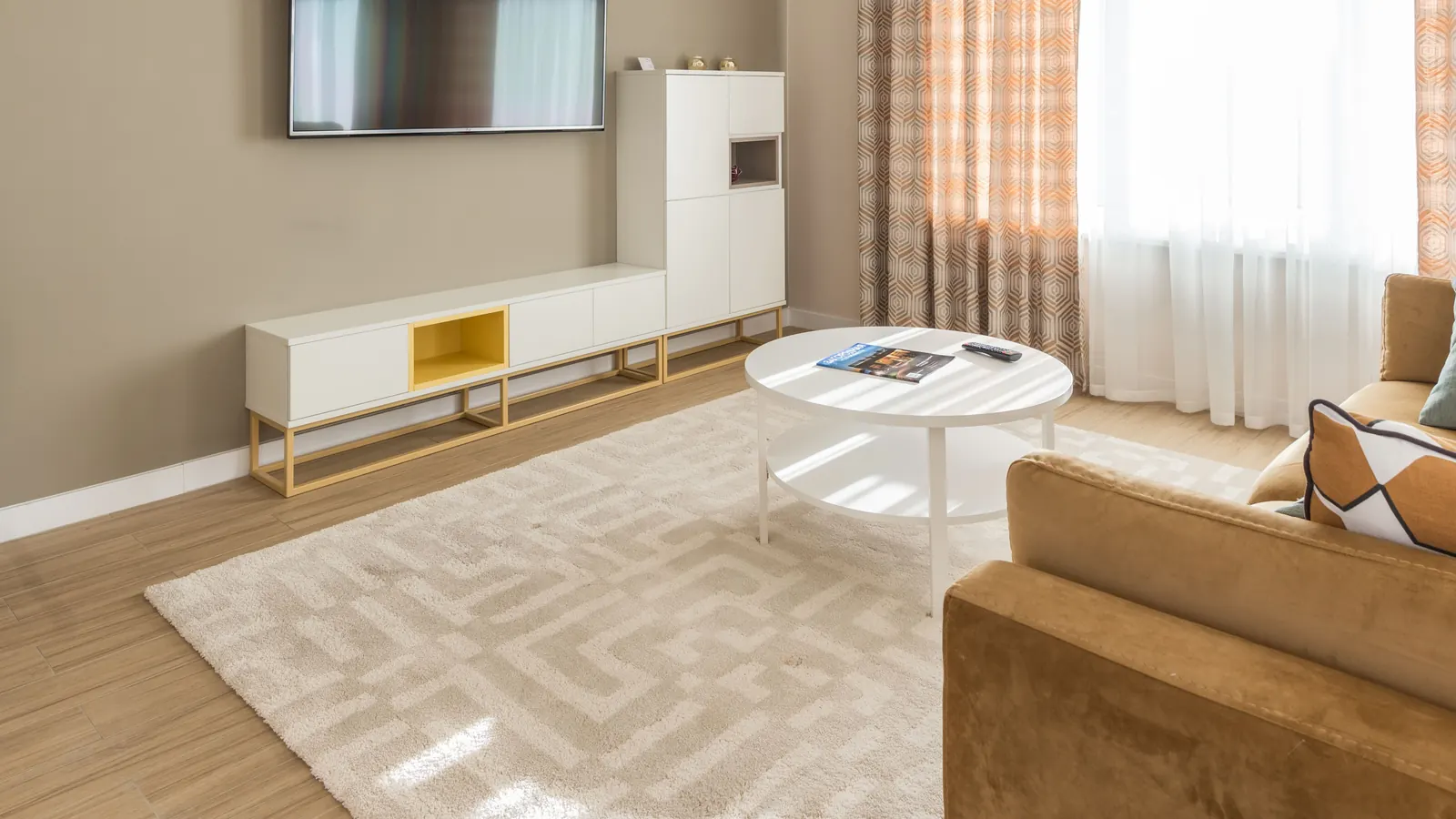
Pale sofa on pale wood. Take a linen sofa, a bleached-oak floor and tall windows that fill the room with light by midday. A cream rug close to both makes a closely related palette, and in a smooth plain weave the room can go flat; a chunky loop or a restrained tonal pattern gives the surface something for that light to catch. A medium taupe does the opposite and makes the sofa’s outline sharper, which helps when the room already has several pale pieces. The rug’s border beside the floor shows the contrast as clearly as the part under the sofa. We would pick the textured cream and let lightness, texture and pattern supply the variety, with no bright accent needed.
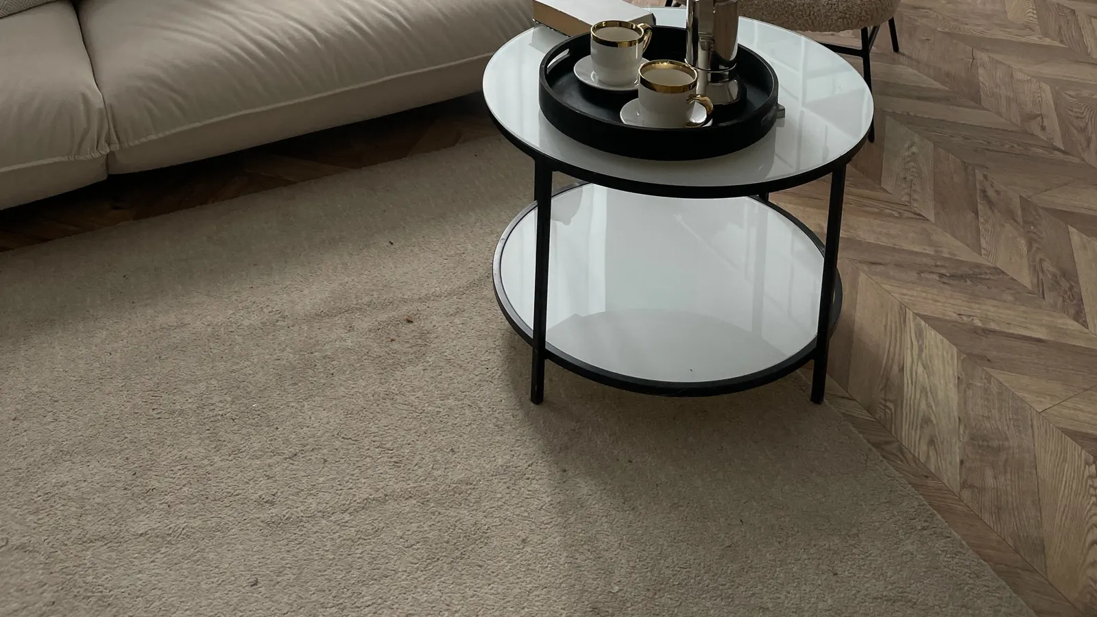
Dark wood with a brown leather sofa. With an espresso floor, a chestnut leather sofa and a low glass coffee table, a lighter beige opens up a visible area between sofa and floor and bounces lamplight back into the room, and a quieter gray-brown with a fine tonal pattern gives a cooler, more restrained look than the golden tones people often assume brown furniture needs. A dark brown rug can also work if the room has contrast elsewhere, as long as the sofa legs stay readable against it. A subtle border or a mixed pattern defines furniture without a pale field, and when a large table hides the center, the border and corners decide the impression. We would choose the gray-brown with a border.
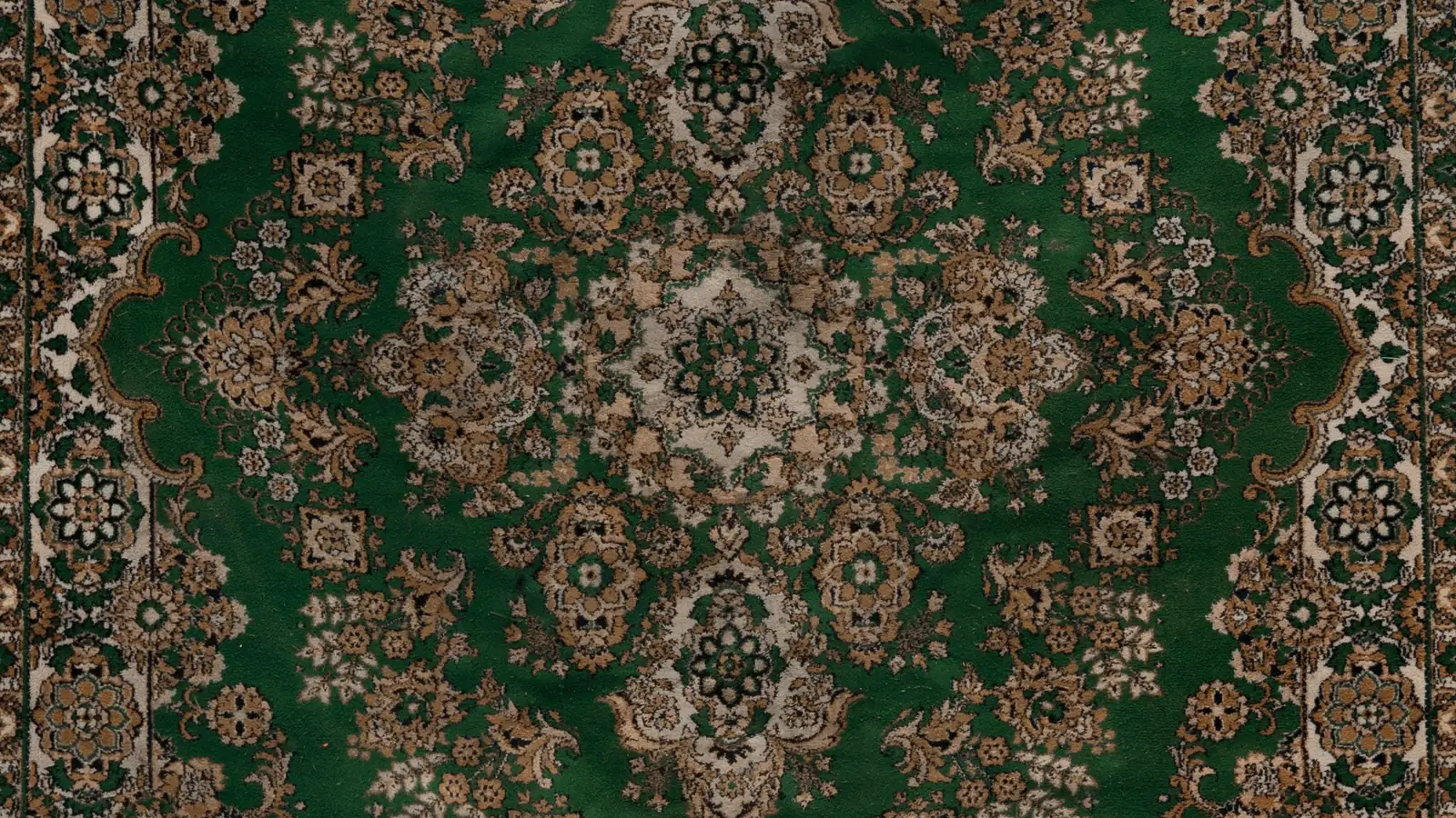
Colorful upholstery or patterned curtains. A plain field leaves the existing textile in charge, and a low-contrast pattern adds a layer without repeating the same motif at the same scale. For a blue sofa, compare cream, gray-brown and a mixed neutral. For floral curtains, the rug can pick up a small background color from the fabric, while an unrelated undertone fights it. Because the border and corners show or hide by size, the rug-size guide is the next stop once the palette is set.
Texture does the work color is not doing
A beige label says little about pile height, fiber or construction. IKEA’s beige-rug collection includes low-pile, high-pile and flatwoven examples that share a color category and look quite different underfoot. Smooth upholstery, glass and a plain floor can take a rug with visible surface variation, such as a chunky loop or a nubby weave. A room already full of textured cushions, woven furniture and patterned curtains may want a quieter, flatter rug.
One color in three surfaces shows the difference most clearly. BENI’s Oat solid rug is a single wool shade that the page offers in three constructions: Atlas Standard, with a pile BENI averages at 1.25 inches, Atlas Low at 0.75 inch, and the flatwoven Zahara at roughly 0.4 inch. In the bleached-oak room above, we would expect the standard pile to give a pale field something for the midday light to catch, the job the chunky loop does in that example; in a room already busy with woven chairs and textured cushions, the flat Zahara face is the quieter choice and lets the color carry the calm. Sizes run from 3 by 5 to 12 by 15 feet, with squares and runners, and BENI weaves each rug by hand to order, quoting 12 to 16 weeks for Atlas and 14 to 18 for Zahara at 9 by 12 and smaller. The page also states that all orders are final, which turns the swatch advice below into a requirement: BENI sells construction squares and colored poms separately, and a seller that accepts returns remains the easier route if you would rather judge the full rug in the room.
View the texture from the doorway as well as up close. A raised pattern that stands out in a close-up may be subtle across the room, and a mottled surface can read as a single color at a distance. Read the composition and construction if the material matters to you, since the color alone cannot tell you whether a rug is wool, jute or something else.
Black and white
Black and white are neutrals, yet a rug that combines them is often the strongest graphic element in a room. Proportion matters: mostly white with fine dark lines feels airy, and mostly dark with pale motifs feels heavy. Small alternating marks blur into a quiet gray at a distance, while broad stripes, large blocks and a strong border stay crisp. Choose how much pattern you want to see around the furniture.
With a pale sofa on a dark floor, a light field with dark details creates a visible area under the sofa and echoes the floor through its dark marks. A dark field makes the sofa stand out more but may blur the rug’s outer edge against the floor. Dark furniture outlines get harder to see against a dark field with pale motifs, and a bed or table can cover the part of a design that attracted you. A border may sit mostly under furniture feet, and a large central motif disappears under an opaque coffee table, so look at the maker’s size options; a good listing shows the design in each size. With patterned curtains or colorful upholstery, compare pattern scale, and if the rug is the star, simplify a nearby textile before repeating every line. Look at the white as well: an off-white that is pleasant alone can make a brighter white beside it look cooler.
Choosing without a showroom
Five nearly identical beiges make the choice harder, so narrow to three directions: one pale warm, one medium gray-brown and one mixed neutral. Hold each swatch against a sofa leg and the baseboard, the two places where a mismatch shows first, and drop any that look yellow or pink against either. A large rug makes a costly first color test, so favor sellers that send swatches or accept returns.
How visible marks are depends on their color, the pattern and the surface, so a dark rug still needs maintenance, and a pale one may have perfectly workable care needs. Read the instructions, backing requirements and permitted pad for the rug you pick. We would start with the warm gray-brown swatch on most mid-toned floors and move lighter or darker only if the sofa disappears.