Nursery Themes: Woodland, Garden, Sky and Simple Color Ideas
A theme connects colors and patterns; it does not need an object on every surface. Woodland and sky directions, four color schemes for existing furniture and where to stop.
By DecoraMintPublished 6-minute readMore in Kids' Rooms
In this guide
We may earn a commission from links on this page, at no extra cost to you. Affiliate disclosure
The crib is the one place in a nursery with no theme at all. CPSC’s safe-sleep advice is “Bare is Best”: a fitted sheet and nothing else, with no pillows, blankets, bumpers or toys. Everything below happens around that bare rectangle, on the walls, the floor, the windows and the adult’s side of the room, and the best themes are built to look good with it empty.
Safe arrangement first, then the pattern
The NIH’s safe-sleep guidance recommends room-sharing with a separate infant sleep space, such as a crib, bassinet or play yard placed near the adult bed, on a firm, flat surface with only a fitted sheet. A nursery can still work as a changing, storage and feeding room while the baby sleeps beside the adults. A retailer’s crib photo is only a picture of a crib, and a theme should never be judged from it.
Decoration near the crib needs the same discipline.
- Hanging items. A children’s hospital safety page, Cedars-Sinai’s, says to remove crib mobiles as soon as a baby can push up on hands and knees; the AAP’s commonly quoted rule adds about 5 months as a cutoff, whichever comes first. Loose garlands, branches and improvised hanging arrangements near the crib are better left out, and we would keep heavy frames, shelves and mirrors off the wall above it altogether.
- Cords. CPSC advises installing cordless window coverings, and moving cribs, beds and furniture away from windows and cords, preferably to another wall; see its window-covering notice. Route lamp and monitor cords behind furniture and away from the crib.
- Furniture. The dresser or shelf beside the changing area should be anchored to the wall with the hardware that came with it, and mounted objects need proper fixings in the right locations.
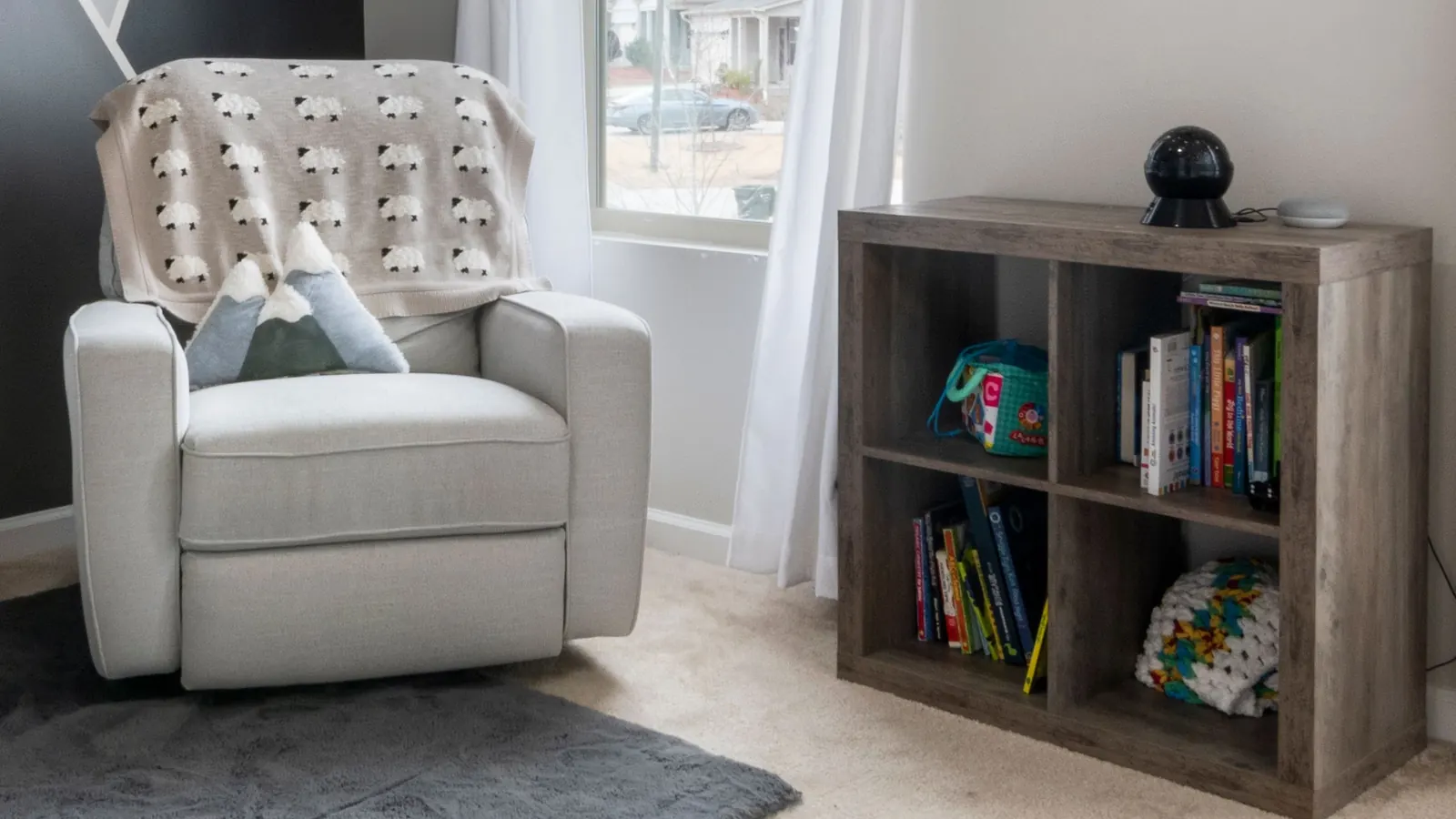
These rules set where the theme goes: walls away from the crib, the rug, curtains on a cordless system, the chair, shelves at adult height.
Build the theme from three parts
Give it a main color family, one recognizable motif and a supporting texture or smaller pattern. A woodland direction might be muted green, leaf shapes and a quiet stripe, without a tree-shaped shelf, animal bedding, forest wallpaper and themed hardware all in the same room.
Let the fixed finishes lead. Warm flooring, a dark dresser or pale cabinets stay visible whatever the inspiration photo showed, so choose colors that sit well beside them. Directions to start from:
- Woodland: leaves, trees or a few related animals, in greens and browns with a simple stripe.
- Garden: flowers and stems, with plain larger textiles and one repeated accent color.
- Sky and weather: clouds, stars or rainbows on a light ground with limited stronger accents.
- Coastal: blue-green tones and waves, in natural neutrals with a simple linear pattern.
- Geometric: dots, checks or stripes on solid surfaces that give the pattern room.
These are visual directions for any household, and any motif or color can go in any nursery.
Woodland without a forest of props
Decide whether you want an illustrated, light woodland or a deeper, more graphic one, because mixing both without a lead makes the room feel crowded. The light version is pale walls, a muted sage textile and one leaf or tree pattern in the colors of birch bark and new leaves. If a wallpaper has five colors, take only one or two into the rest of the room. Repeating all of them turns a reference into a matching exercise.
The deeper version can use a green wall or a large botanical repeat as the feature, with plain storage and large textiles around it so the pattern stays readable. The darkest color does not have to cover every wall: think about what you see from the doorway and from the adult chair. A small group of related animal illustrations looks more coherent than unrelated characters scattered everywhere, and the idea can be carried by a leafy pattern, warm neutrals and a few related colors with no animals at all. Living plants and loose natural materials raise separate care and access questions, and the look can do without them.
Palettes for a baby girl, a baby boy or neither
People often search by a baby’s sex, and the four combinations below work for anyone. Start from the furniture and floor you already have, then decide whether the room wants more contrast or a closer relationship between its biggest surfaces.
Blush, olive and brown furniture. A restrained pink with a green of similar visual weight, on a cream background, suits a garden direction. Brown furniture stays as it is instead of being repainted to match. Put blush on one larger decorative surface and olive in a small leaf pattern or the adult-chair fabric. A broad leafy repeat creates a focal point, while a small scattered floral works as a background. View the pink beside a warm brown or orange floor before committing, since a retailer’s white studio shot can misrepresent that relationship.
Plum, cream and pale furniture. Plum gives a clearer contrast than pale pink without a dark room. Keep it to a selected pattern or feature area on cream walls, so pale furniture stays visible. A plum-and-cream check emphasizes rhythm, and a floral in the same colors is more literal. Compare the pale furniture with the cream, since it may look warm, cool or gray beside it, and a deliberate gap looks better than two whites chosen from unrelated screens.
Blue, clay and a warm floor. A small clay-colored accent connects blue walls or a blue pattern to warm flooring. Treat the floor as part of the composition. For a sky theme, use one blue-led pattern and clay in a smaller detail away from the sleep space. If the blue is very deep, test a small area first and compare the view from the doorway with the view from the chair, because shelves in front of a strong wall break it into pieces.
Teal, ochre and light walls. Decide which of the two leads and use the other sparingly. A geometric direction suits the pair: a larger teal shape with a small ochre accent, then the reverse. Dark furniture outlines itself against light walls, while pale furniture hands attention to the accents, and either can be right. When both colors appear in equal amounts on many surfaces, the room looks busier than the two-color plan suggested.
For all four, list the main pattern or surface, the supporting finish and one optional accent, and mark what you own. That keeps an inspiration board from becoming a reason to replace every useful object.
Sky and weather
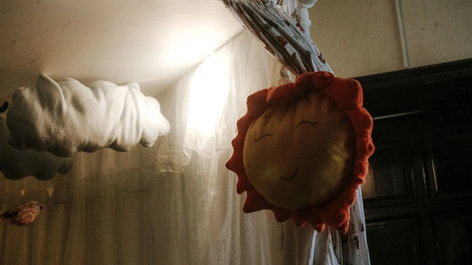
Clouds, stars and rainbows work together when the shapes and colors relate. A rainbow can use a smaller group of tones than every bright primary, tied to the existing floor and furniture. One wall pattern may establish the idea, with quieter surfaces around it instead of clouds on the light fixture, shelf, rug and every container.
Wallshoppe’s Weather Icons wallpaper by Meri Meri in White is listed among its removable and traditional wallpapers, and the page describes it as made to order and non-refundable. That makes a sample worth ordering first, and the instructions for the selected format govern wall preparation, application and any drying or ventilation needs. Wallshoppe’s nursery collection is the retailer link on this page. For the wider furniture and textile choices, the bedroom hub is the place to continue.
Where the theme stops
Leave practical equipment practical. A storage unit, changing setup or adult chair does not need to look like part of the motif; coordinate its finish or a nearby color and keep a useful piece even if it lacks the theme. Keep some surfaces empty for daily supplies and easy cleaning, and if each new purchase means moving another object, the room has enough.
Look at paint, wallpaper and textile samples in the room at different times of day, against the fixed finishes and not just each other, because catalog photos are shot in other light. For wall treatments, follow the product’s own preparation and application instructions, since removable does not mean compatible with every paint, texture or rental agreement.
Buy in this order: the main pattern, then the supporting colors, then optional accents, and live with the first two before adding the third.
Retailers to browse
Compare colors, sizes, materials and return details on the retailer’s current listings.
- Browse nursery wallpaper at Wallshoppe
Wallshoppe
Opens Wallshoppe’s nursery wallpaper collection, not a single product.